A New Look, Built on the Same Foundation
Drive from Winnipeg toward Kenora and you can feel the moment it happens. The prairie gives way to the Canadian Shield. Rock breaks through the soil, wildflowers crowd the roadside, and water starts showing up between the pines.
This is lake country, Falcon Lake, the Whiteshell, Lake of the Woods, and building here has never been like building anywhere else. That is why, today, we are introducing a new identity for Lumber One.
How the rebrand came about
Our website had not changed in years. Meanwhile, the projects coming out of our yard had changed a lot. Full cottage builds on boat access islands. Additions and boathouses designed from scratch with Jamie. Materials delivered across the ice to sites nothing else could reach. We were doing premium work for premium properties, and our brand was not showing any of it.
This refresh exists to close that gap. It is not a new company. It is the same people and the same standard of work, given a look that actually reflects the calibre of what we build and the properties we build it for.
What's new
A new logo and colour palette
A rebuilt website
New in-store signage
New vehicle wraps
Our new logo
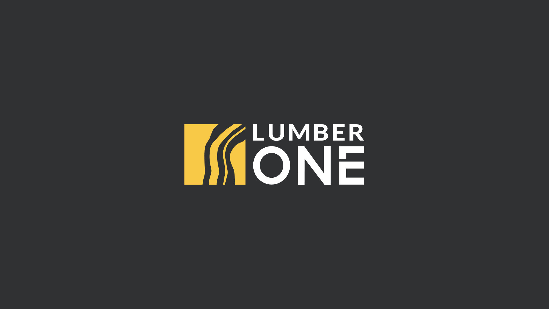
The mark draws from the shoreline itself. The lines trace wood grain, but they also read as pathways and survey lines, a map of land being planned before anything gets built. That felt right, because nothing on a lake country build should be arbitrary.
A refreshed colour palette
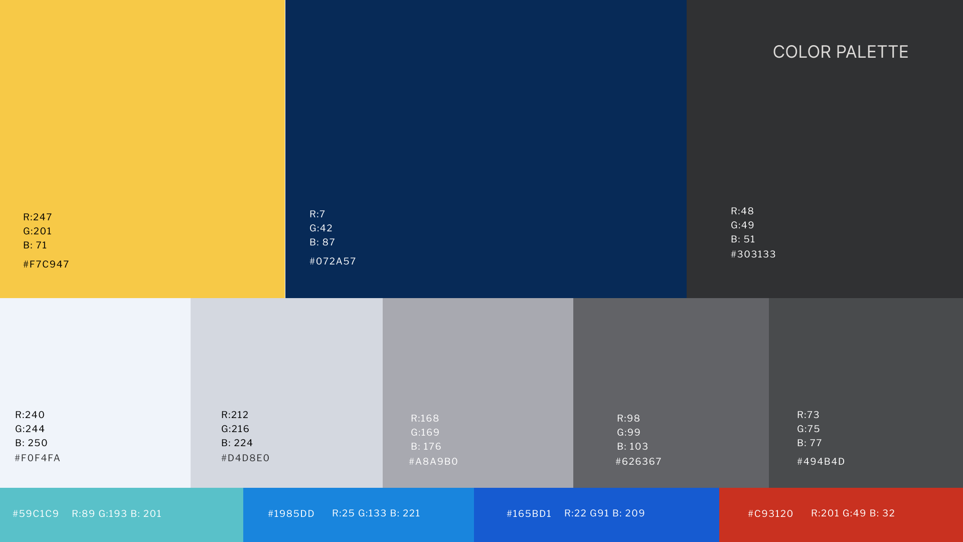
Charcoal is the anchor. It is the colour most building supply brands lean on for a reason, signalling trust, reliability, and a company that will still be there through the life of a project.
Gold is the warmth of our brand. This tone echoes late afternoon sun on the water, sand, and the natural tone of wood itself, and it keeps the brand from feeling cold or corporate. As a rule, we never use the blue and the gold together in the same element. Each carries its own moment.
Grey does the quiet work of structure, giving everything room to breathe. A supporting teal shows up as a tertiary accent, a colour almost nobody else in this category is using, which gives us a bit of room that is genuinely our own.
Who we are
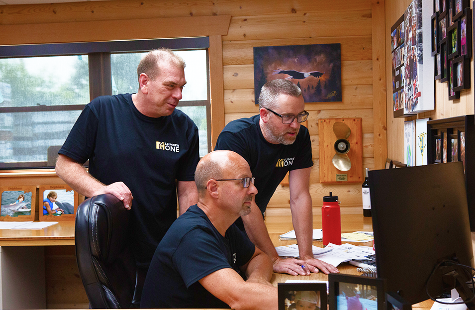
Strip away the new logo and what is actually here is a set of relationships built over years. Glenn, who can tell you which fastener a contractor needs before they finish the sentence. Jamie, turning a rough idea into a working blueprint. Greg, holding the whole yard together from behind the counter.
None of that changes with a rebrand. If anything, the point of this refresh is to finally give that expertise a presentation that matches it. Aspirational, grounded in real skill, and not another discount retailer competing on price.
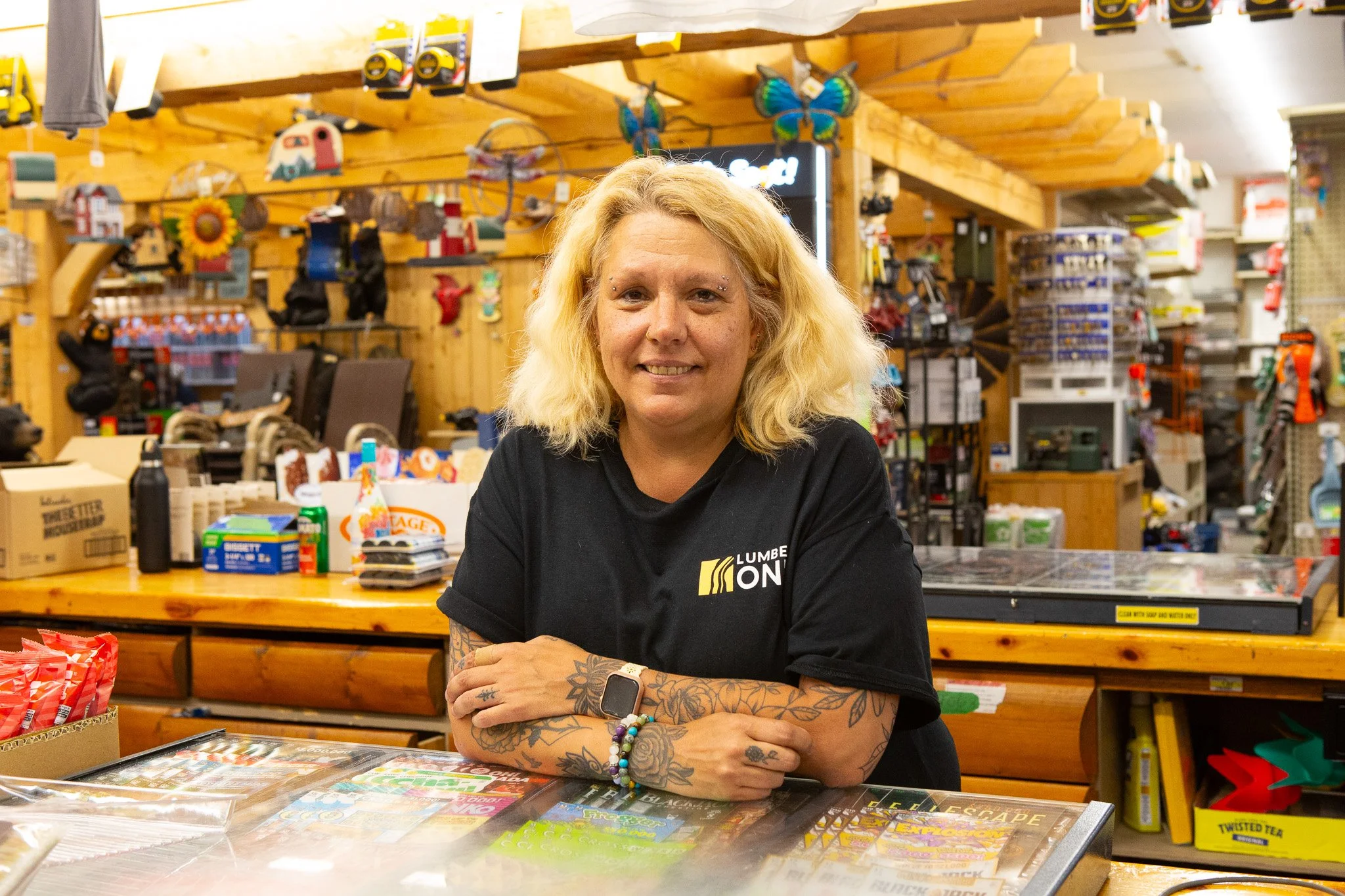
The builders making it real
Over the coming months, expect to see more of the people constructing these properties in lake . The contractors we have supplied for years, who trust us to have materials on site exactly when a job needs them, whether that means a truck, a forklift, or an ice road.
Expect contractor profiles, honest looks at active builds, and product features that explain the reasoning behind a material rather than just listing it.
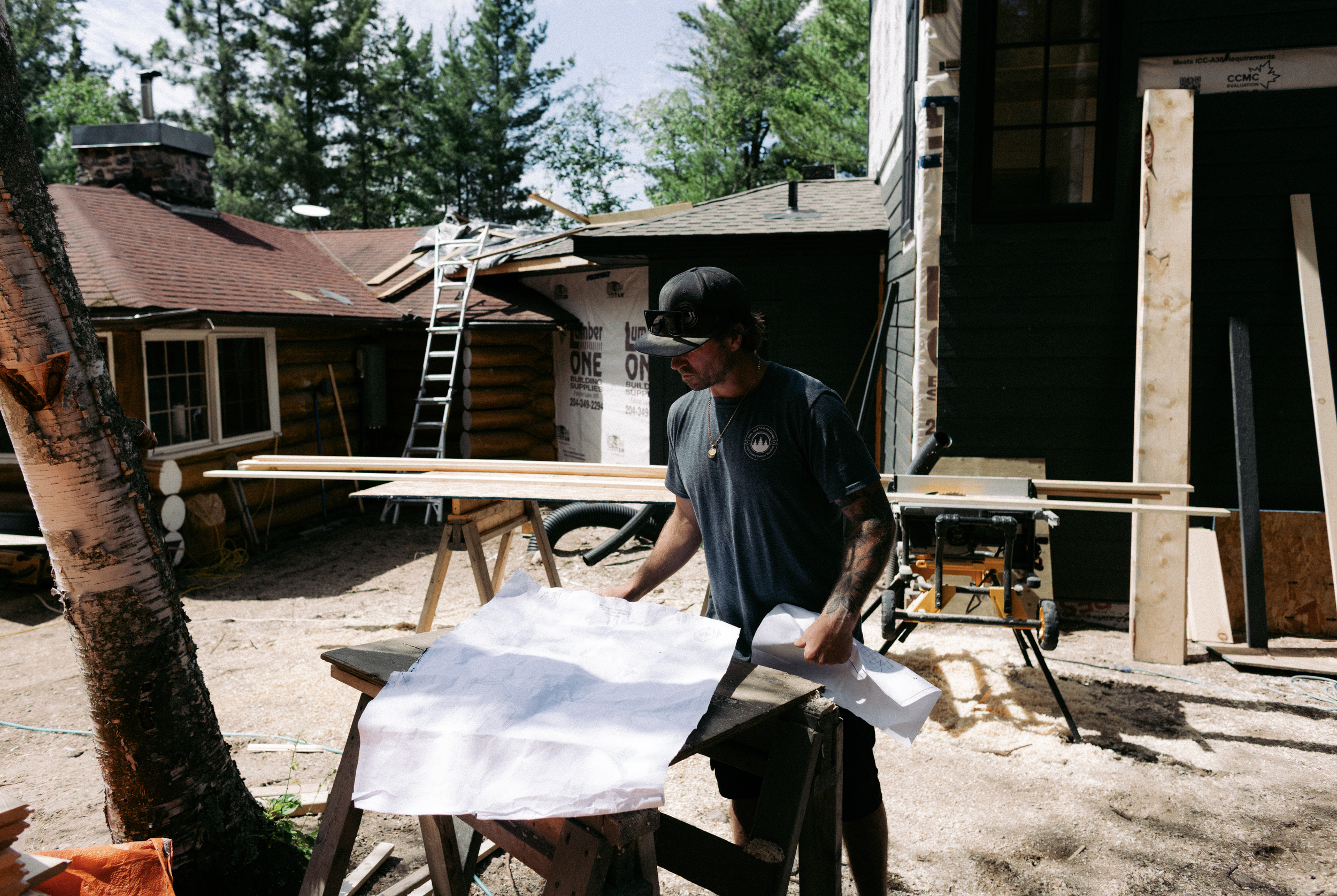
Our values
Know the terrain
Show up, every time
Design it right, the first time
Build relationships
We'd love to hear from you
The number is still (204) 349-2294. The yard is still open. A conversation with Jamie still starts with a phone call, not a form. If you have got a project underway anywhere in lake country, give us a call or drop by the yard..